



Beige is Banned: The Problem with Playing it Safe
“Beige is banned” is something I say quite often in the studio.
People occasionally think I mean the colour. I don’t. For me, beige means safe. Vanilla. Perfectly pleasant, unlikely to offend anyone, and quite difficult to remember.
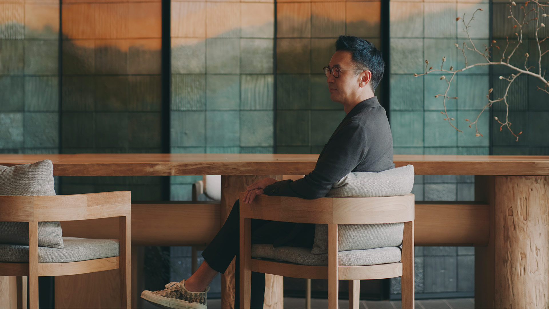
Quiet luxury has become a familiar language in hospitality: restrained palettes, understated materials, a certain visual calm. There is nothing wrong with any of that. In the right place, it can be exactly the answer.
The problem comes when restraint becomes a formula.
Increasingly, owners tell us they want something different. They want their hotels to stand out and, more importantly, to be remembered. At the same time, they still want timelessness.
For me, that raises a simple question: Not only is it good, but will anyone remember it?
Timeless Doesn’t Mean Neutral
A hotel has a long lifecycle. Nobody wants to redesign it every few years because last decade’s trend suddenly looks like last decade’s trend. There is a financial reality to that too: a hotel that dates quickly becomes an expensive hotel to keep relevant.
For us, longevity starts with the place. We look at what has shaped it: its history, landscape, culture, architecture, and people. Those things give the design roots. Sometimes those roots sit with the owner too. One developer we recently met had spent 20 years assembling the land for his hotel.
What made a place important 100 years ago can still be relevant today; our job is to interpret it for now. But that doesn’t mean filling a hotel with recognisable motifs.
A modern interior can belong perfectly well in a historic setting if the connection is genuine. Ideally, a guest should feel that connection without needing someone to explain it.
That is a much stronger basis for timelessness than simply making everything neutral.

Quiet Has Its Place
Quietness, for me, is a state of mind rather than an aesthetic. A spa might slow you down. A bar might need to energise you. A lobby has another role entirely. The design should respond to what that space is meant to make people feel. Colour, pattern or restraint can all play a part, but none of them defines whether a space is quiet.
On one recent project, the owners completely changed direction. What began as a modern scheme became what we called a “modern mansion”. The building itself was new, but the interiors needed to feel as though they had acquired character over time.
It was richer, more decorative and much further from what people might traditionally expect from BLINK.
It was also right for that client, and that matters more.

No House Style
People who have known BLINK for many years sometimes associate us with pared-back, modern Asian design. I understand why, but the work has changed considerably. Today we are designing everything from highly restrained resorts to colourful, detailed, and quite theatrical spaces. I sometimes describe BLINK as a chameleon, which is intentional.
A Raffles should not look like a Park Hyatt. A hotel in Tanzania should not feel interchangeable with one in Kyoto. Even if we work with the same owner twice, there is no reason to give them the same answer. Our clients hire us to create something for them once, and every site, owner, brand and cultural context should produce its own response.
The process may be consistent, but the outcome should not be.
Listen Past the Brief
At a recent client dinner in Africa the chairman kept asking the waiter for paper so he could sketch ideas for us. By the end of the evening, I had four or five drawings.
He apologised several times because he said he couldn’t draw. I kept them anyway.
The drawings themselves were not really the point. I wanted to understand why he was drawing those particular things.
Owners often start with a specific request: a colour they like, a hotel they have visited, something they have seen elsewhere. Taking that request literally is easy, but understanding the ambition behind it is more useful. Safe design can also come from following a brief too closely, without getting to the reason behind it.
That is often where the character of the project starts to emerge.
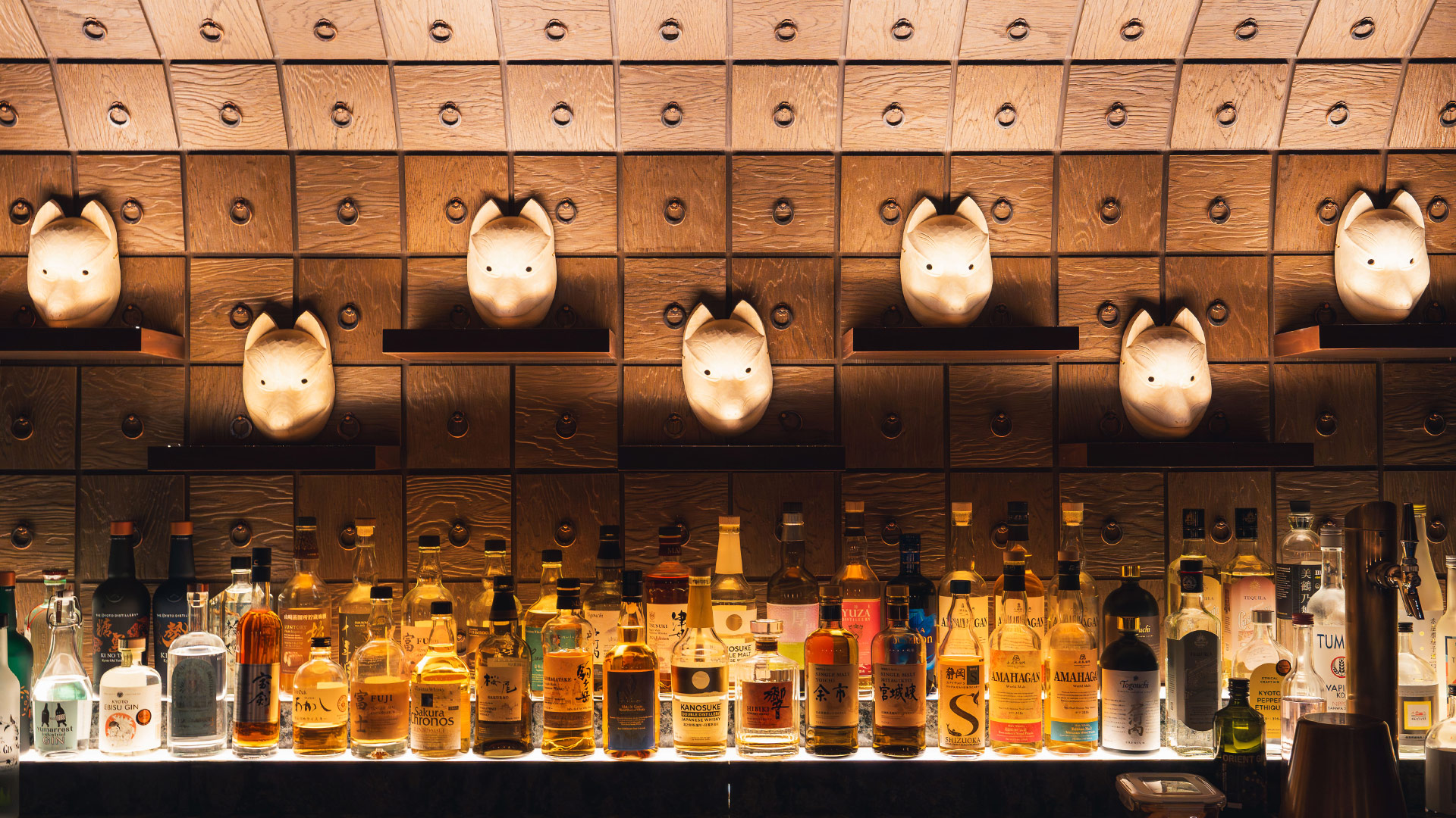
Make It Memorable
Hotels become part of people’s lives. Guests return over the years, and the place gathers meaning through those repeated stays.
I think nostalgia is underrated in hospitality.
Guests may not be able to explain why a place feels right, but they do remember how it made them feel.
That is what I mean when I tell the team a design needs to be less beige. It does not need to be louder or more decorative; it needs enough character to be remembered.
Timeless design still needs a point of view. Otherwise, it risks lasting a very long time without giving anyone much reason to remember it.